How to Make Dark Mode App Icons
Since iOS 18, Apple introduced dark and tinted mode options for app icons. Learn how to create stunning dark mode icons that transform beautifully - like Duolingo, Flighty, and Raycast do.
Dark Mode Icons: The New Standard
Since the launch of iOS 18, Apple has introduced dark and tinted mode options for developers. You can either upload your main app icon and let iOS configure the dark mode automatically, or you can be creative with it - like Duolingo, Flighty, and Raycast do - creating actual Dark Mode icons that feel intentional and polished.
These little tweaks in dark icon mode can make all the difference pic.twitter.com/bJMz85be9k
— Andreas Storm (@avstorm) April 30, 2025
The difference between a good app and a great one often comes down to these details. When users switch to dark mode at night, your icon should feel like it belongs there.
Why Custom Dark Mode Icons Matter
Automatic dark mode conversion works, but it's generic. Your icon gets a simple filter applied-desaturated, darkened, done. It's functional but forgettable.
Custom dark mode icons let you:
- Reimagine the lighting - How would your icon look under dim lighting or a dark sky?
- Adjust contrast intentionally - Some elements need more pop in dark mode, others should recede
- Maintain brand recognition - Keep your icon recognizable while adapting to the context
- Show attention to detail - Users notice when developers care about the small things
The Creative Approach
Think about your icon in a different environment. A bright, sunny app icon might feature warm colors and soft shadows. But at night? Consider:
- Cooler color temperatures
- Subtle glows instead of harsh highlights
- Deeper shadows with softer edges
- Elements that might "light up" in the dark
Duolingo's owl gets sleepy eyes at night. Flighty's plane flies against a darker sky. These aren't just darker versions - they're reimagined for the context.
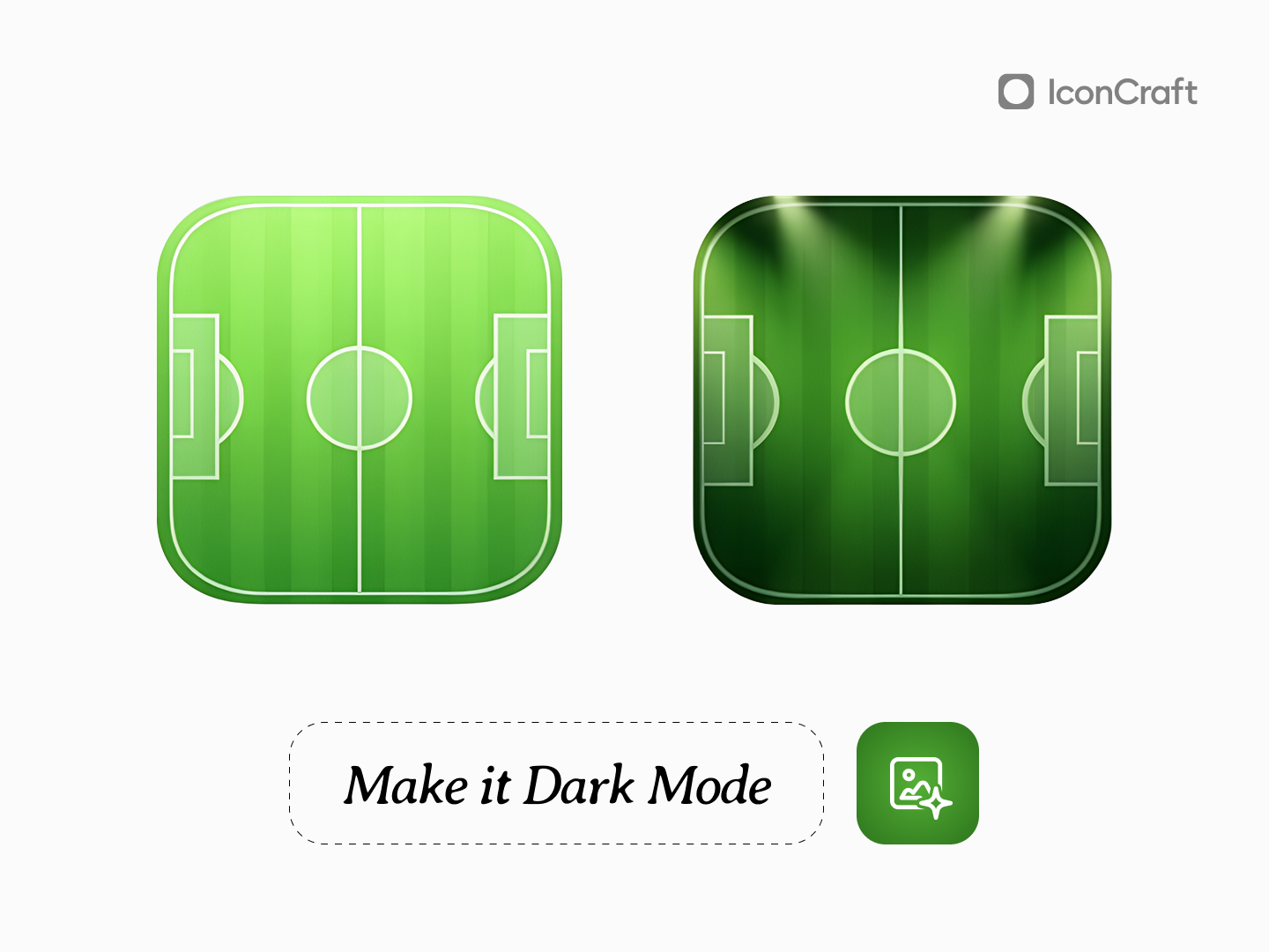
How to Create Dark Mode Icons with IconCraft
Creating dark mode variants is simple with IconCraft's Edit mode:
1. Switch to Edit mode - Toggle from Create to Edit at the top of the playground 2. Describe the transformation - Select 'Dark Mode' style, Click on 'Get Ideas' button to get AI suggestions for dark mode icon, or you can use prompts like:
- "Make it dark mode"
- "Add night time lighting"
- "Imagine it in dark mode"
The AI understands context. It won't just slap a dark filter on your icon - it will thoughtfully adjust lighting, shadows, and colors to create something that feels native to dark mode.
Best Practices for Dark Mode Icons
Don't just invert colors - Pure black backgrounds can feel harsh. Consider deep grays or dark blues.
Maintain silhouette recognition - Your icon's shape should be instantly recognizable in both modes.
Consider the home screen context - Your icon sits among others. Make sure it doesn't disappear or clash.
Keep the same visual weight - If your light mode icon feels bold, your dark mode version should too.
Start Creating
Your app deserves an icon that looks intentional in every context. With iOS 18's dark mode support, users expect apps to adapt - and the ones that do it thoughtfully stand out.
Try creating your dark mode variant today. One prompt. One transformation. Two icons that feel like they belong together.
Related Articles
Create Designer-Grade App Icons in seconds
Turn Your App Idea Into a Stunning Icon – No Designer Needed